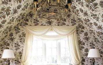
(The image above is a chandelier thought for the dining room. ) To give you an idea of what we're dealing with: Our budget is really tight right now & so we're doing things like temporarily painting over linoleum & using what we have until we can afford what we really want. Below are some photos of the kitchen now:
The beautiful flourescent light will be one of the first things to go (I might use this vintage chandlier I found with
Eddie in NY-- It'll look much better once I clean it up!! :)
Below is another view of the kitchen into the living room/ dining room:
The cabinets are newly installed, but they aren't right for the house. The crown moulding & arched uppers don't suit the house, which is simple, and very contemporary & natural-feeling.
To give you an idea of my color scheme, I want to show you some of the fabrics we're using in the living room (below), since the kitchen is open to it.
The fabric below is a creamy-warm-beigey velvet with a hint of white sparkle to it. (Depending upon the way the light hits it, it can look cream, golden or white.) This image does simply not do it justice:

This fabric is a oatmealy-gray super-nubby, burlappy linen:

The fabric below is an overscale linen toile that I'll be using on the reverse: (I tried to play with the image to give you an idea of what it looks like on the reverse) There are hues of all of the other fabrics we're using in this fabric & it was the inspiration fabric I started with.
(I'll be posting my living area plans later & will go into more detail about what each fabric will be used for, but hope you get the idea for now.) I'm going for old-fashioned meets simple-clean. (The image below is my Grandma Maestranzi's old platinum china that I have now & love. --Cannonsburg Wild Clover- I think it really embodies what I'm going for: simple, clean but with some intricate, old-fashioned detail.)
I want to have some beautiful florals & borderline "grandma" fabrics & antiques & accessories mixed in with clean-lined pieces and fresh, crisp natural fabrics. The overall look will be fresh & happy & light & airy.
At first glance the space should feel fairly transitional/ modern & very natural, but upon closer inspection, I hope people (ok, seriously probably only my design-loving friends) will notice that there is a real hommage to tradition & days gone by, but in a fun & playful way. I want to feel comforted & reminded of certain things & people from my childhood, but don't want my home in another era either.
SO- now that you get the feeling/ mood of what I'm going for, here are the details! To start with, we'll be painting the linoleum floors white. There's a breakfast nook in the kitchen: (scary in this pic, yes I know)

I'm ditching the cornice above the window, trimming out the window in simple square boards & lining the walls with paper. I'm leaning towards these finalists & would love your input:
1) Cowtan & Tout's Botanique Spectaculaire (Thank you Dana for finding out the name!!) and I just love the sunflowers- so happy & beautiful!! I also love how wild they are...
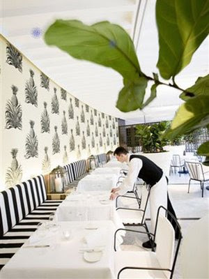
2) Studio Printworks' Pinapple paper. Again, I love it & I love how happy it is & pineapples are my favorite fruit & it's a kitchen... Yet I worry is it strange because I live in Virginia to have pineapples on my wall??? **** UPDATE: I FORGOT TO MENTION IN THE ORIGINAL POST: I would be using a smaller-scaled version of this pineapple (called "pineapple petite") but don't have photos of it in use********

so fun though!!


3) The paper below is a custom wallcovering from
www.commware-int.com/ and I'm IN LOVE. I've emailed them as to price (I'm scurred!!) and haven't heard back yet. I might want it a hint warmer.

--- hahaha, ok this is too funny!!! my husband just walked in & surprised me with a bouquet of sunflowers for my birthday!!! I think maybe Botanique Spectaculaire is meant to be!!----------------------- (ok, but I still need your opinions!! ;)
So for the window, we'll probably go with simple white linen roman shades & a window seat & cushion (in a fun white vinyl) underneath:

For the table, I'm seriously considering going for a Saarinen-type table.
It's totally Tom Scheerer's fault (see below.) When I saw this image for the first time in House Beautiful, it was the first time I actually like the tulip table. It was the combination of modern & traditional elements that did me in. Now, I'd also love some input here. I know we won't be buying the real thing. Andy thoughts on the knock-offs? I'm leaning towards a white marble top and would love to find a vintage knock-off, but what do you think?? Is it "go all the way or go home" in this case??
We already have the Swedish chairs below, and I think their simple clean lines will work:

We're ripping the doors off of the upper cabinets (hahaha love how I'm like "ripping"?!! Can you tell I want them OFF?!!) & will keep the shelves in place and paint them gray so it will look something like this: (both kitchens below are Martha Stewart's)
I have lots of white dishes, bowls etc & will stock up the shelves. (There should be room for more though!! ;)
For the cabinet paint, I'll pull a gray out from whichever paper we do settle on. If we go with the sunflowers, I think the Ralph Lauren color (below) looks perfect.


Above, it's Ralph lauren "Mountain Sage" (SF02A)--(and although it looks good on the screen, I think the actual color has more green & so we'll most likely be looking for a color that looks like this color does on the screen)
For the backsplash, I'm leaning towards white hexagonal tiles or some other white tiles. (If I go with the marble topped saarinen table, marble would be pretty, like below)

For an island, I found an antique walnut blanket chest a couple of years ago in Antioch, IL where my dad lives. I planned to use it in his kitchen but he really wasn't into it, so now it's mine! (It has better lines than the one pictured below-- not so much into the country legs at the bottom in the photo-- but is of similar shape & color)
Eventually, I'd like to top it with a thick slab of marble:

For the countertops, we've been going in a few different directions. Originally I was dying for soapstone (below), but now I'm also considering more white marble.
I'm still leaning towards soapstone because I think it would be beautiful with the black in the wallpaper and provide a nice contrast against all the white and I LOVE its look... NEED the laundry sink, below, in my kitchen, whether it be stainless, soapstone or porcelain:
BUT... If I went with soapstone, would I have too much going on with the gray cabinets, walnut island and 2 different counter colors? And would the kitchen be more pulled together if at least one of the 2 moveable pieces- either the table & island- had some connection to the grounded cabinets?? (I'd love to hear thoughts here!) I'll get an idea of the look because we already have black formica. yum yum!

We definitely want to go with stainless steel appliances... you would be surprised though how cheap some standard stainless fridges are now that there are bottom-freezer models!!
There's definitely more to come & I'll post fun details as we make more decisions. If you get the chance, can you let me know your thoughts - and especially on the wallpapers, countertops & saarinen table?? I really do value your opinions- you have no idea how much!! :)


 (Above Chaffee Braithwaite's living room AGAIN ;) I'm using it as inspiration... I'll be going with a bit more warmth & a little washed/ muted pattern. My goal is for the room to feel light airy, natural, raw, fresh with a classic modern feel and a hint of old-fashioned pretty. I want a fairly neutral backdrop for ever-changing accessories & shots of color. (In the image above, I love the jolts of green from the wheatgrass and views for Springtime!)
 For the sofa, I knew exactly what I wanted: English arms with turned legs on casters. (Because- #1- I like to rearrange often & usually do it by myself while my husband's gone & the sofa is always the toughest thing to move, so casters = problem solved!! #2- I want the space to feel large, open & airy, and of course legs will help with this, and #3- I love the classic with a hint of old-fashioned lines of this sofa. It'll work perfectly with both traditional & modern pieces. So, below is what I was looking for ( I was hoping for 1 or 2 cusions instead of 3)


 The only thing is, I just came accross this driftwood chair from Oly Studios & I'm sort of in love... I really like balance & don't feel that a piece like this should have a matching partner & don't so much have a spot for a lone chair... (I might be able to squeeze it on somewhere though)
 Now, across from the sofa will be two chairs with my fun metal vintage table in between:


 We love to entertain & of course kick up our feet so I love the idea of one of these 2 leather 0upholstered benches from Oly Studio:


 Here's the view of the dining area/ work area... Since we'll have an eat-in kitchen & island with stools I don't envision nightly meals in the dining area. We'll primarily use it for projects, reading, and entertaining. It'll be nice not to have to put projects away every night!


 The wingchair below is one of my favorite wingchairs, by Martha Stewart. It's got nailhead detailing & is of a really manageable size for smaller spaces. (Some are so huge!!)
  Now, for the chandelier... Here are some I love from Bobo Intriguing Objects: The wine barrel chandelier:


 so fun though!!


 --- hahaha, ok this is too funny!!! my husband just walked in & surprised me with a bouquet of sunflowers for my birthday!!! I think maybe Botanique Spectaculaire is meant to be!!----------------------- (ok, but I still need your opinions!! ;)


