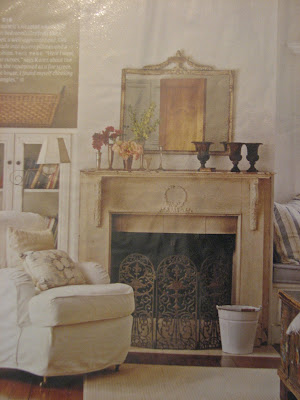
Images with flash end up being dark & cold & cheap-looking. (above & below)
 Now, check out the "after" (below). It's light & airy and much better:
.jpg) 2) Shoot during the day when the lighting is good. (Unless you're specifically after nighttime shots like a Christmas tree at night or candles or something special like a city view.) Here is our living room when we first moved in. (With all of my lovely decor from my old apartment... eeeeeek) I didn't use flash on it even though it was taken at night: (which is good)
2) Shoot during the day when the lighting is good. (Unless you're specifically after nighttime shots like a Christmas tree at night or candles or something special like a city view.) Here is our living room when we first moved in. (With all of my lovely decor from my old apartment... eeeeeek) I didn't use flash on it even though it was taken at night: (which is good) But check out the difference in the same room during the day: (no flash of course)


How much prettier do these (below) look? No clutter, no flash... HUGE difference:

 Styling for the kitchen: Sometimes people actually go too sterile when photographing kitchens. But, remember you can ditch items like your toaster (if it's not cute & takes up too much space), sponges, pot scrubbers, pens & pencils, etc. Consider having a pretty soap dish or dispenser, nice towels, good-looking cooking utensil holder, a bowl of fruit and/ or vase of flowers.
The pictures above & below are from when we sold our house so actually a few things are missing because staging is different from decorating (like the pretty towels & a few things that might warm it up) but we did set up a couple of bottes of Aquafina on the bar, which I always think looks nice. (I love Aquafina bottles & totally refill them with fresh water & stick them back in the fridge!!)

 Show personal, but not-too-personal-items that make the space look lived in: NOT the box of tissues but maybe a cool glass of water in a vintage glass or a pair of glasses on a stack of pretty books..
For living rooms, a lot of the same things apply. Use pretty pillows and interesting accessories. Get rid of any clutter that isn't attractive. Always add fresh flowers or greenery if you have time. You'd be surprised what a huge difference adding flowers/ greenery into the room does. Again, the goal is to make the space look "lived-in" but not cluttered.
 Pottery Barn is awesome at styling in my opinion. I might not always be in love with what they're selling but I'm always so impressed with their styling. (above) For dining rooms, make sure there's something beautiful on the table. It doesn't necessarily have to be a set table (which does look gorgeous) but it could be something simple like a pair of lanterns or dinnerware stacked up as if it's about to be set with a little vase of fresh flowers.

Take advantage of tabletops & shelves. Every surface is a change to create something beautiful. It's important to train your eye. Scour catalogs & design magazines & notice all the details that are present & missing. You'll be surprised by how much you can learn & by how good you'll get.
4) Use a tripod or hard surface to set the camera on. I'm really guilty of not following this rule and it shows. This is huge because if you're not using flash, it's really easy for the photo to blur and any movement at all messes the photo up. (Virtually none of the photos I take myself are clear enough, probably because if this!! ok, I know what I need to go buy!!)
5) Leave out any unattractive features in the room from the shot... Depending upon the look/ mood you're going for, this could be anything from the TV, to speakers, to the chair that you just haven't had the time/ money to reupholster yet.

6) Shoot from lots of different angles & take TONS of pics. I'm not a professional photographer so I don't know which angle a shot will look best from so I take them all. This way, I get tons of photos of one room & I have my pick of which shot works best. I'm often surprised that the one I thought would work the best, doesn't. Get low, get high, go straight on... try it all. (You'll eventually get the hang of what usually works best & won't have to always take so many shots but it's good to start out this way to find out what you like. )
7) Figure out the style of photography you like & try to emulate it. There is a HUGE difference between Architectural Digest & Domino. I made the (HUGE!!!) mistake of spending $$$$s on a photographer who did work for Architectural Digest to shoot for my portfolio. His work was amazing, but totally not my style. The photos ended up looking static & serious to me, which was not how I wanted my work coming across at all. The angles were all straight on & I couldn't feel any movement in the room. I was able to use a few shots that I loved, but overall for the amount of money I spent, I was really disappointed. (They're all on my website now & it drives me CRAZY!!! arg!!) But the point is, it was my fault. I didn't have enough knowledge of the style of photography I wanted. If you can figure out what you like, you can immitate it. (country living image below)

So, there you have some info on how to get better interior shots. I know I didn't address any technical issues & that would be because I'm still clueless in that arena!!! (I have yet to read my camera's manual so that might help a bit!) Hope everyone had a great weekend!!!
xoxo,
lauren
 It's often difficult to convince your partner of your vision & to come to his or her "senses" and agree with you. ;) (I have to say right off that I am one of the lucky- my husband may not always agree with me, but he does completely trust me now & even if he doesn't "get it" at first, he lets me go ahead--- to date the only thing I think he's hated is that


 Now you can't change your partner's personality, but you can change how you present your design ideas to him or her. Think of the way you can present your idea that will most likely get you a positive response. Figure out what type of decision-maker your partner is & present your ideas accordingly.

 or
or 2. Do options scare him? [ Show him or her your plan.]
  3. Does he or she need to think they came up with the idea on their own?? (Oh good luck here and please watch "My Big Fat Greek Wedding'--- "The man is the head of the family and the woman is the neck who can move the head any way she wants it.")


 8. Does your partner just think you don't "need" something? [ First make sure that you really do "need" it before proceeding & then explain why you think you need it & why it'll improve things & what it'll do for the space.]
 So anyway, figure out how you and your partner work together. What's the best way to present a design idea for him/her to be most receptive? What type of decider is your partner?
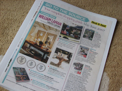 I have 14 different categories & I separate all the pictures into separate style files. Each file is in a binder & I put the torn out pages into clear page protectors. I also save all of the 'resources' sections from the back of the magazines and put them in a separate folder in case I need anything for future reference. I always make sure to write the month & magazine name at the bottom of each photo (if it's not there already) so I can easily find anything in the resource folder if I need it later. (I didn't used to do this in the beginning & regret it!!)
  I chose 14 categories because it worked for me (I could probably have done more) & because I had storage boxes that I wanted the binders to fit into perfectly. (ha! I know, I can be OCD at times!) But I really like having the files transportable so I can take them around the house with me: into the living room to watch a movie or (eeesh, should I be admitting this?!!) into the bedroom

 I tear out all the pictures from magazines & put them in page protectors when we're watching a movie. That pile then gets put into all the different binders. But I keep one of these big baskets (below) as my filing basket & all the pages waiting to go in stay there because I'm never done. As my tastes evolve, I also recategorize the rooms and I get rid of pictures I'm not interested in any more.
  Just to warn you, some of these categories & the pics I've put into them may seem out of left field, so don't think I'm crazy!! I realize there's a lot of overlap & the point of the Style Files is for you to be able to to have a reference that works for you. So this-however illogical it may seem! - works for me. :)


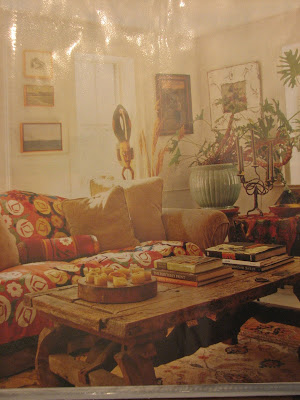
 3. "Vibrant- Bohemiam- Eclectic" These rooms have bright colors & feel as if they were created over time with collected items. A world-traveller might live here. Or a hippie. The items in the rooms are interesting & the rooms have that laid-back collected look.




 5. "Today's Cottage" These homes are usually a play of old & new. Theyhave those older, charming, cottage elements to them but they are also infused with modern furnishings & elements. You feel as if you're in an older home that has been brought perfectly into today.


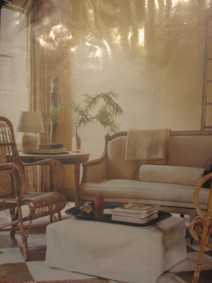


 10. "Rustic Elements" This one is fairly self-exaplanatory & has rustic elements such as raw beam celings, stone fireplaces, rough hewn furniture, and antlers. Some of these rooms are surprisingly quite refined.

 11. "Villa Style" These homes are huge & typical of an Italian or Spanish villa or Mediterranean- style homes. They have cathedral ceilinegs, and can have some rustic elements &/ or Moorish & Tuscan elements. I don't do much of this and so again, lots of different styles have been squeezed into one file but it makes sense for me.