She shares several design tips:
Design philosophy: “The whole idea is to keep things as simple as possible; I like everything pared down to its purest form.”
Consider the light: “The light on Martha’s Vineyard is the most beautiful light ever. It’s like the light in an Edward Hopper painting. It’s absolutely beautiful, just operatic—how the sun rises and sets, and then the moon comes up and goes down. I’m so infatuated with it that I don’t have anything on the walls except for a couple of maps.”
The decor should reflect the structure and setting “My house is a sturdy thing that has survived nor’easters. Where the house was situated, on a hill, and the sturdiness of it was what I loved. The post-and-beam design is about seeing the skeleton of the house, but it felt like there were no walls. I thought if I added Sheetrock walls to it, it would clean it all up and make it feel more finished. Now it feels unencumbered. There’s a real purity to it.”
Live in a place before making any decisions. “I lived here for a year before I did anything to the house, which I think is a smart thing to do before you renovate. You want to see how people move around the house, where the traffic is, and where people like to be. My interior designer, Marsha Russell of Satinwood Ltd., and I figured that out first before we changed anything—though I ended up overruling the architect a few times.”
Practicality rules. “There’s nothing easily broken in my house. There are no side tables in any of the bedrooms, just shelves that stick out from the wall. The outside is so beautiful—the simpler the inside is, the more you are going to stare out the window.”
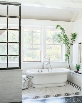
Make the most of a few materials. “I just went around putting in painted-brick and bluestone in the bathrooms. And I found some old sinks in upstate New York, including a huge soapstone farm sink that I installed atop stacked painted-bricks.”
Look locally for inspiration. “I went to a fantastic old Vineyard house—full of painted-brick and cast iron in the kitchen. I took tons of pictures of that, and that became thematic for my own home.”
White is right. “I used a combination of different shades of Farrow & Ball white paints—there are several whites on the walls.”
Textures soften a space“I wanted the furniture to be comfortable and not hard-edged, and the gray mesh curtains soften all of the angles of the room. There’s a mix of textures—masculine and feminine; soft and hard.”
If you like it, stick with it“I found a vintage light fixture I liked, so I had them copied and made two for each bedroom.”
Never stop looking for inspiration“I do nothing but rip pages out of magazines. One idea leads to the next.”


0 comments:
Post a Comment